The foundation has accessibility as its core value. It goes without saying that its own documents are accessible.
Accessible documents
Introduction

Accessibility of a document?
blind people
For users of a screen reader or a Braille tool, a (hidden) layer of coding must be present in a document. These codings allow quick navigation. Style codings such as “Head1”, “Head2” and "Head3" are used for this. In addition, the document must contain meta-data. That is information about the information. The title of the note, the author and the language are examples of this. Double spaces and multiple “Enters” in succession are undesirable. If tables are used then no cells should be merged or split. The cells in the first row must be filled with the row headers. The cells in the first column should be filled with column headings. Do not use bulky tables. An image in the document that is relevant must be accompanied by a description. Give the meaning of the image in that description. If an image is not relevant then an empty alternative text” must be added.
visually impaired
There are also other conditions for visually impaired people.
The contrast between foreground and background should be great. A sans serif font should be used. Arial and Verdana are examples of this. The font size should be chosen so that there are between 60 and 70 characters on a line of text. The line spacing should be at least 1.25 times as large as the number of dots of the chosen font size. Bright light in the background can not only be very unpleasant for the visually impaired, but also make text and images unreadable.
color blindness
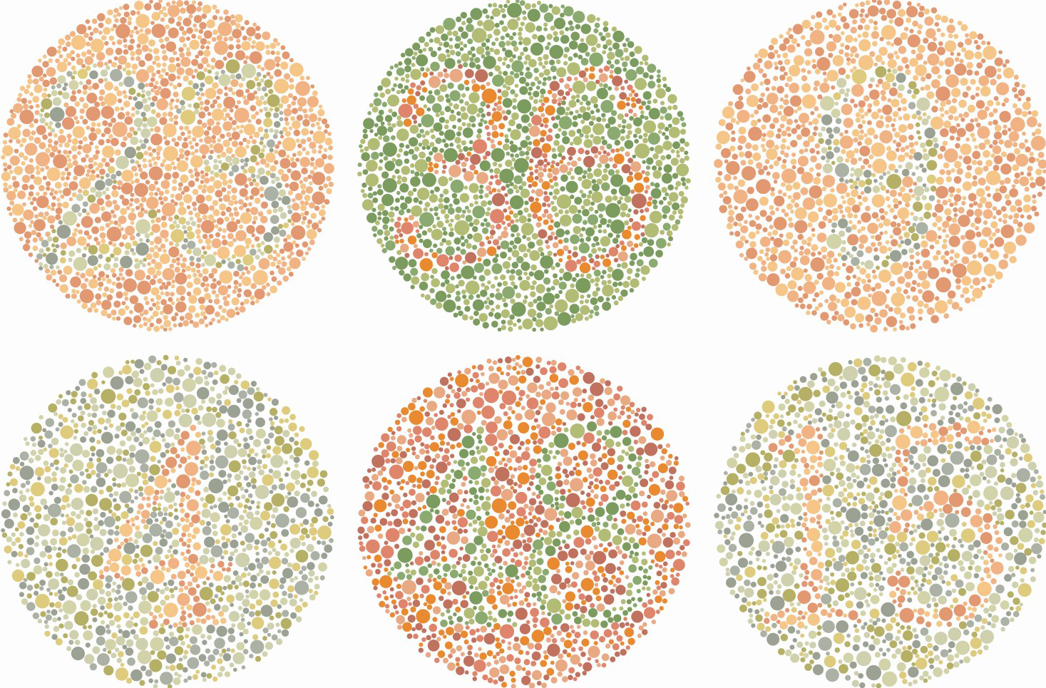
Attention must be paid to the different forms of color blindness. Certain combinations of colors are undesirable.
Lower reading level
Texts should be written at a low reading level. Short sentences are needed. The use of words should be simple and close to the spoken language. If written at reading level B1, then 80% of the Dutch understand the text. Writing these kinds of documents is not easy. For low-literate people, whose reading level is lower than B1, additional actions must be taken.
Hearing Impairment

If a video or podcast is included in a document, subtitling is a solution.
Resources for Writers
Visual impairment

In Word, style encodings such as “Heading1”, “Heading2”, “Heading3”, ”Standard” and “Summary” can be used. Furthermore, meta-data can be added to the properties of the document.

In addition, perform a contrast check. For example, do this with the “Color Contrast Analyzer” program.
Lower reading level, low literate people
A reading level tool is available on the Accessibility website that can be used to test whether a text is also readable for low-literate people. The link is: reading level tool
Hearing Impairment

Subtitling short films is relatively easy. For example, with the iOS app “Clips” spoken text is added as subtitles. These subtitles can also be edited.